
使用纯CSS实现了多个滤镜效果展示
时间:2024-09-30 17:30热度:588
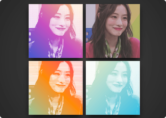
使用纯CSS实现了多个滤镜效果展示,包括半色调、径向、木刻和网格滤镜,适用于前端开发中图像处理和视觉效果的学习和应用。
使用纯CSS实现了多个滤镜效果展示,包括半色调、径向、木刻和网格滤镜,适用于前端开发中图像处理和视觉效果的学习和应用。(源码来自网络,仅供学习参考!)
源码:
<!DOCTYPE html>

<html lang="zh">

  <head>

    <meta charset="UTF-8" />

    <title>自制滤镜效果</title>

    <style>

      body {

        display: grid;

        place-content: center;

        height: 100vh;

        background: radial-gradient(circle at center, #444, #222);

      }

      body:before {

        content: '';

        position: absolute;

        bottom: 2.5px;

        left: 50%;

        transform: translate(-50%, 0);

        color: #fff;

        font-family: 'Futura';

        font-size: 12px;

      }

      body > div {

        display: grid;

        grid-template-columns: repeat(2, 1fr);

        grid-template-rows: repeat(2, 1fr);

        grid-column-gap: 2.5vmin;

        grid-row-gap: 2.5vmin;

      }

      body > div div {

        width: 45vmin;

        height: 45vmin;

        position: relative;

        overflow: hidden;

        box-shadow: 0 20px 40px -10px #000;

        --bg: url('https://p5.itc.cn/images01/20231127/340845dfe685413cb4809627ca3ed2f9.jpeg')

          50% 50% / cover;

        background: var(--bg);

      }

      body > div div:hover:before,

      body > div div:hover:after {

        opacity: 0;

      }

      body > div div:before,

      body > div div:after {

        content: '';

        position: absolute;

        top: 0;

        left: 0;

        width: 100%;

        height: 100%;

        transition: opacity 0.25s ease-in-out;

      }

      body > div div:before {

        filter: saturate(0);

        background: var(--bg),

          radial-gradient(closest-side, #222, #fff) 0px 0px/0.75vmin 0.75vmin;

        background-blend-mode: multiply;

        filter: saturate(0) brightness(1.25) blur(0.5px) contrast(30);

      }

      body > div div:after {

        background: linear-gradient(

          43deg,

          #4158d0 0%,

          #c850c0 46%,

          #ffcc70 100%

        );

        mix-blend-mode: screen;

      }

      body > div div:nth-of-type(2) {

        --bg: url('https://p5.itc.cn/images01/20231127/340845dfe685413cb4809627ca3ed2f9.jpeg')

          50% 50% / cover;

      }

      body > div div:nth-of-type(2):before {

        background: repeating-radial-gradient(

            circle at 75% 40%,

            #333 1px,

            #fff 1px,

            #fff 5px,

            #333 5px,

            #333 6px

          ), var(--bg);

        filter: saturate(0) brightness(1.25) blur(0.75px) contrast(30);

      }

      body > div div:nth-of-type(2):after {

        background: linear-gradient(147deg, #ffe53b 0%, #ff2525 74%);

      }

      body > div div:nth-of-type(3) {

        --bg: url('https://p5.itc.cn/images01/20231127/340845dfe685413cb4809627ca3ed2f9.jpeg')

          50% 50% / cover;

      }

      body > div div:nth-of-type(3):before {

        background: repeating-linear-gradient(

            to bottom,

            #000 1px,

            #fff 1px,

            #fff 5px,

            #000 5px,

            #000 6px

          ), var(--bg);

        filter: saturate(0) brightness(1.25) blur(0.75px) contrast(40);

      }

      body > div div:nth-of-type(3):after {

        background: linear-gradient(45deg, #40e0d0 -25%, #ff8c00, #ff0080 125%);

      }

      body > div div:nth-of-type(4) {

        --bg: url('https://p5.itc.cn/images01/20231127/340845dfe685413cb4809627ca3ed2f9.jpeg')

          50% 50% / cover;

      }

      body > div div:nth-of-type(4):before {

        background: repeating-linear-gradient(

            to bottom,

            #333 1px,

            #fff 1px,

            #fff 6px,

            #333 6px,

            #333 7px

          ), repeating-linear-gradient(

            to right,

            #333 1px,

            #fff 1px,

            #fff 6px,

            #333 6px,

            #333 7px

          ), var(--bg);

        filter: saturate(0) brightness(1.25) blur(0.75px) contrast(30);

      }

      body > div div:nth-of-type(4):after {

        background: linear-gradient(-45deg, #2bc0e4, #eaecc6);

      }

    </style>

  </head>

  <body>

    <!-- partial:index.partial.html -->

    <div id="wrap">

      <div></div>

      <div></div>

      <div></div>

      <div></div>

    </div>

    <!-- partial -->

  </body>

</html>


文章标题:使用纯CSS实现了多个滤镜效果展示
文章链接:https://www.tzzbj.com/Web/107.html
所有文章未经授权禁止转载、摘编、复制或建立镜像,违规转载法律必究。
本站部分内容来源于网络,仅供大家学习与参考,如有侵权,请联系站长邮箱:906080088@qq.com进行处理。
下一篇:用纯CSS实现的胖丁气球动画

扩展阅读


文章评论