用纯CSS实现的胖丁气球动画
时间:2024-09-30 16:26热度:756
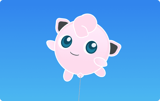
本页面展示了一个用纯CSS实现的胖丁气球动画,适合前端开发者学习和参考,展示了如何使用CSS制作复杂的动画效果,提升网页互动体验。
本页面展示了一个用纯CSS实现的胖丁气球动画,适合前端开发者学习和参考,展示了如何使用CSS制作复杂的动画效果,提升网页互动体验。
效果图:
源代码:(源码来自网络,仅供学习参考!)
<!DOCTYPE html>

<html lang="en">

  <head>

    <meta charset="UTF-8" />

    <title>胖丁气球</title>

    <style>

      html {

        height: 100%;

      }


      body {

        position: relative;

        background: #56ccf2;

        background: -webkit-linear-gradient(to top, #56ccf2, #2f80ed);

        background: linear-gradient(to top, #56ccf2, #2f80ed);

        height: 100%;

        margin: 0;

        padding: 0;

        overflow: hidden;

      }


      #jigglyBod {

        background-color: #fed9eb;

        border: 5px solid #fff;

        border-radius: 50%;

        width: 300px;

        height: 300px;

        position: absolute;

        z-index: -2;

      }


      #jigglyBod:after {

        content: '';

        display: block;

        background: #fed9eb;

        background: -webkit-linear- gradient(#fdeefe, #fed9eb);

        background: linear-gradient(#fdeefe, #fed9eb);

        border-radius: 50%;

        position: relative;

        width: 280px;

        height: 250px;

        top: 10px;

        left: 10px;

      }


      .leftEye,

      .rightEye {

        background-color: #fff;

        border-radius: 65% 50%;

        width: 80px;

        height: 80px;

        position: absolute;

        z-index: -1;

      }


      .leftEye {

        transform: rotate(-15deg);

        top: 90px;

        left: 20px;

      }


      .rightEye {

        transform: rotate(-15deg);

        top: 110px;

        left: 160px;

      }


      .leftEye:before,

      .rightEye:before {

        content: '';

        display: block;

        position: relative;

        background-color: #0e4c63;

        border-radius: 65% 50%;

        width: 70px;

        height: 60px;

        transform: rotate(-35deg);

        top: 10px;

        left: 12px;

      }


      .rightEye:before {

        left: 10px;

        height: 65px;

      }


      .leftEye:after,

      .rightEye:after {

        content: '';

        display: block;

        position: relative;

        background-color: #1b7e9d;

        border-radius: 65% 50%;

        transform: rotate(140deg);

        width: 60px;

        height: 50px;

        position: relative;

        bottom: 45px;

        left: 18px;

      }


      .rightEye:after {

        width: 51px;

      }


      .leftPupil,

      .rightPupil {

        background-color: #0e4c63;

        border-radius: 65% 50%;

        transform: rotate(20deg);

        width: 40px;

        height: 50px;

        position: absolute;

      }


      .leftPupil {

        top: 95px;

        left: 52px;

      }


      .rightPupil {

        top: 119px;

        left: 190px;

        width: 43px;

        height: 45px;

      }


      .leftPupil:before,

      .rightPupil:before {

        content: '';

        display: block;

        background-color: #0e4c63;

        background: linear-gradient(

          to bottom,

          rgba(254, 255, 255, 1) 0%,

          rgba(221, 241, 249, 1) 64%

        );

        border-radius: 65% 50%;

        width: 20px;

        height: 25px;

        position: relative;

        top: 5px;

        left: 14px;

      }


      .rightPupil:before {

        width: 25px;

      }


      .mouth {

        background-color: #000;

        width: 50px;

        height: 20px;

        position: relative;

        top: 180px;

        left: 90px;

        transform: rotate(15deg);

        border-radius: 50%;

      }


      .mouth:before {

        content: '';

        display: block;

        background-color: #fcdff7;

        width: 50px;

        height: 20px;

        position: relative;

        bottom: 3px;

        border-radius: 50%;

      }


      #ears {

        position: absolute;

      }


      .leftEar,

      .rightEar {

        background-color: #fed9eb;

        border: 5px solid #fff;

        width: 80px;

        height: 90px;

        position: relative;

        border-radius: 20% 50%;

        transform: rotate(3deg);

        top: 0;

        z-index: -3;

      }


      .leftEar:before,

      .rightEar:before {

        content: '';

        display: block;

        background-color: #42474a;

        width: 70px;

        height: 70px;

        border-radius: 20% 50%;

        position: relative;

      }


      .leftEar:before {

        top: 13px;

        left: 10px;

      }


      .rightEar {

        left: 267px;

        transform: rotate(295deg);

      }


      .rightEar:before {

        width: 63px;

        left: 6px;

        top: 8px;

        position: relative;

      }


      #hair {

        position: absolute;

      }


      .circles {

        background-color: #fed9eb;

        width: 100px;

        height: 100px;

        position: relative;

        border-radius: 50%;

        border: 5px solid #fff;

        transform: rotate(70deg);

        left: 120px;

        bottom: 35px;

      }


      .circles:before {

        content: '';

        display: block;

        background-color: #fed9eb;

        border-radius: 50% 30%;

        border: 5px solid #fff;

        transform: rotate(-89deg);

        position: relative;

        width: 90px;

        height: 90px;

        top: 30px;

        right: 2px;

      }


      .circles:after {

        content: '';

        display: block;

        background-color: #fed9eb;

        border-radius: 50% 20%;

        border: 5px solid #fff;

        width: 60px;

        height: 60px;

        position: relative;

        bottom: 40px;

        left: 50px;

      }


      .block {

        background-color: #fed9eb;

        border-radius: 50%;

        width: 41px;

        height: 80px;

        transform: rotate(155deg);

        position: absolute;

        top: -31px;

        left: 155px;

      }


      .block:before {

        content: '';

        display: block;

        background-color: #fed9eb;

        width: 30px;

        height: 30px;

        position: absolute;

        bottom: 63px;

        left: 9px;

      }


      .block:after {

        content: '';

        display: block;

        background-color: #fed9eb;

        width: 40px;

        height: 30px;

        position: absolute;

        transform: rotate(6deg);

        bottom: 38px;

        left: 61px;

      }


      #arms {

        position: absolute;

      }


      .leftArm,

      .rightArm {

        background-color: #fed9eb;

        border: 5px solid #fff;

        background: -webkit-linear-gradient(#fed9eb, #fdeefe);

        background: linear-gradient(#fed9eb, #fdeefe);

        border-top-left-radius: 90%;

        border-bottom-right-radius: 90%;

        border-bottom-left-radius: 20%;

      }


      .leftArm {

        width: 60px;

        height: 60px;

        transform: rotate(75deg);

        position: relative;

        top: 100px;

        right: 40px;

        z-index: -3;

      }


      .rightArm {

        border-top-right-radius: 30%;

        width: 50px;

        height: 60px;

        transform: rotate(255deg);

        position: relative;

        top: 105px;

        left: 230px;

      }


      .leftLeg,

      .rightLeg {

        background-color: #fed9eb;

        border: 5px solid #fff;

        border-radius: 30% 30% 100% 100%;

        transform: rotate(15deg);

        width: 45px;

        height: 70px;

        position: relative;

        top: 250px;

        left: 60px;

        z-index: -3;

      }


      .rightLeg {

        transform: rotate(-50deg);

        position: relative;

        top: 140px;

        left: 230px;

      }


      .string {

        background-color: #ffd1ec;

        border: 4px solid #fff;

        position: relative;

        width: 20px;

        height: 20px;

        z-index: 10;

        border-radius: 30% 0% 60%;

        transform: rotate(45deg);

        top: 118px;

        left: 140px;

      }


      .string:before {

        content: '';

        display: block;

        background-color: #ffe1f4;

        width: 17px;

        height: 17px;

        position: relative;

        border-radius: 100% 10%;

        overflow: hidden;

        top: 3px;

        left: 3px;

      }


      .string:after {

        content: '';

        display: block;

        background-color: #b0b2af;

        position: relative;

        width: 2px;

        height: 400px;

        transform: rotate(-44deg);

        bottom: 63px;

        left: 150px;

      }


      #pokeman {

        position: absolute;

        top: 50%;

        left: 50%;

        margin-top: 50px;

        margin-left: -130px;

        animation: jiggly 5s infinite;

        transform-origin: bottom center;

      }


      @keyframes jiggly {

        from,

        to {

          top: 0px;

          animation-timing-function: ease-in-out;

        }


        50% {

          top: 100px;

          animation-timing-function: ease-in-out;

        }


        0%,

        100% {

          transform: translateY(0) rotate(-4deg);

        }


        50% {

          transform: translateY(-25px) rotate(4deg);

        }

      }

    </style>

  </head>

  <body>

    <div id="pokeman">

      <div id="jigglyBod"></div>

      <div id="ears">

        <div class="leftEar"></div>

        <div class="rightEar"></div>

      </div>

      <div id="hair">

        <div class="circles"></div>

        <div class="block"></div>

      </div>

      <div class="leftEye"></div>

      <div class="leftPupil"></div>

      <div class="rightEye"></div>

      <div class="rightPupil"></div>

      <div class="mouth"></div>

      <div id="arms">

        <div class="leftArm"></div>

        <div class="rightArm"></div>

      </div>

      <div class="leftLeg"></div>

      <div class="rightLeg"></div>

      <div class="string"></div>

    </div>

  </body>

</html>


文章标题:用纯CSS实现的胖丁气球动画
文章链接:https://www.tzzbj.com/Web/105.html
所有文章未经授权禁止转载、摘编、复制或建立镜像,违规转载法律必究。
本站部分内容来源于网络,仅供大家学习与参考,如有侵权,请联系站长邮箱:906080088@qq.com进行处理。

扩展阅读
文章评论