
给网页加入加载动画
时间:2024-04-24 14:25热度:1177
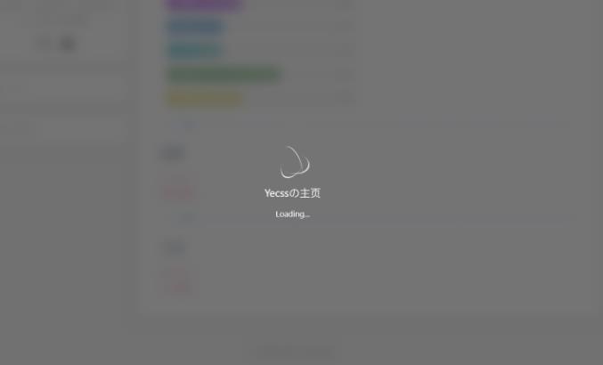
如何给网页加入加载动画呢?简单的来说,就是提前准备好一个加载动画的效果在页面上,利用 JS 判断页面是否加载完成,加载完成后隐藏或者移除动画即可。如下图:
如何给网页加入加载动画呢?简单的来说,就是提前准备好一个加载动画的效果在页面上,利用 JS 判断页面是否加载完成,加载完成后隐藏或者移除动画即可。如下图:
具体的实现
HTML部分
<!--加载动画 start-->

<div id="loading-box">

  <div class="loading-left-bg"></div>

  <div class="loading-right-bg"></div>

  <div class="spinner-box">

    <div class="loader">

      <div class="inner one"></div>

      <div class="inner two"></div>

      <div class="inner three"></div>

    </div>

    <div class="loading-word">

      <p class="loading-title" id="loading-title">Yecssの主页</p>

      <span id="loading-text">Loading...</span>

    </div>

  </div>

</div>

<!--加载动画 end-->
CSS部分
#loading-box .loading-left-bg,

#loading-box .loading-right-bg {

  position: fixed;

  z-index: 999998;

  width: 50%;

  height: 100%;

  background-color: rgb(81 81 81 / 80%);

  transition: all 0.7s cubic-bezier(0.42, 0, 0, 1.01);

  backdrop-filter: blur(10px);

}


#loading-box .loading-right-bg {

  right: 0;

}


#loading-box > .spinner-box {

  position: fixed;

  z-index: 999999;

  display: flex;

  justify-content: center;

  align-items: center;

  width: 100%;

  height: 100vh;

}


#loading-box .spinner-box .loading-word {

  position: absolute;

  color: #ffffff;

  font-size: 0.95rem;

  transform: translateY(64px);

  text-align: center;

}


p.loading-title {

  font-size: 1.25rem;

  margin: 20px 10px 4px 10px;

}


#loading-box .spinner-box .configure-core {

  width: 100%;

  height: 100%;

  background-color: #37474f;

}


div.loaded div.loading-left-bg {

  transform: translate(-100%, 0);

}


div.loaded div.loading-right-bg {

  transform: translate(100%, 0);

}


div.loaded div.spinner-box {

  display: none !important;

}


.loader {

  position: absolute;

  top: calc(50% - 32px);

  left: calc(50% - 32px);

  width: 64px;

  height: 64px;

  border-radius: 50%;

  perspective: 800px;

  transition: all 0.7s cubic-bezier(0.42, 0, 0, 1.01);

}


.inner {

  position: absolute;

  box-sizing: border-box;

  width: 100%;

  height: 100%;

  border-radius: 50%;

}


.inner.one {

  left: 0%;

  top: 0%;

  animation: rotate-one 1s linear infinite;

  border-bottom: 3px solid #efeffa;

}


.inner.two {

  right: 0%;

  top: 0%;

  animation: rotate-two 1s linear infinite;

  border-right: 3px solid #efeffa;

}


.inner.three {

  right: 0%;

  bottom: 0%;

  animation: rotate-three 1s linear infinite;

  border-top: 3px solid #efeffa;

}


@keyframes rotate-one {

  0% {

    transform: rotateX(35deg) rotateY(-45deg) rotateZ(0deg);

  }


  100% {

    transform: rotateX(35deg) rotateY(-45deg) rotateZ(360deg);

  }

}


@keyframes rotate-two {

  0% {

    transform: rotateX(50deg) rotateY(10deg) rotateZ(0deg);

  }


  100% {

    transform: rotateX(50deg) rotateY(10deg) rotateZ(360deg);

  }

}


@keyframes rotate-three {

  0% {

    transform: rotateX(35deg) rotateY(55deg) rotateZ(0deg);

  }


  100% {

    transform: rotateX(35deg) rotateY(55deg) rotateZ(360deg);

  }

}
js部分
//加载完成后执行

window.addEventListener(

  'load',

  function () {

    //载入动画

    $('#loading-box').attr('class', 'loaded')

    $('#bg').css(

      'cssText',

      'transform: scale(1);filter: blur(0px);transition: ease 1.5s;'

    )

    $('.cover').css('cssText', 'opacity: 1;transition: ease 1.5s;')

    $('#section').css(

      'cssText',

      'transform: scale(1) !important;opacity: 1 !important;filter: blur(0px) !important'

    )

  },

  false

)


文章标题:给网页加入加载动画
文章链接:https://www.tzzbj.com/Web/65.html
所有文章未经授权禁止转载、摘编、复制或建立镜像,违规转载法律必究。
本站部分内容来源于网络,仅供大家学习与参考,如有侵权,请联系站长邮箱:906080088@qq.com进行处理。

扩展阅读


文章评论